display:grid布局
叶江怀 2020-09-06 css
# Css-Grid 布局
Flex布局是轴线布局,只能指定“项目”针对轴线的位置,可以看作是一维布局,Grid布局则是将容器划分成“行”和“列”,产生单元格,然后指定项目所在的单元格,可以看作是二维布局,Grid布局远比Flex布局强大
# 布局方式 - 常用的三种
# 1、传统的布局方式
利用 position 属性 + display 属性 + float 属性布局 ,兼容性最好,效率低
# 2、flex 布局
有自己一套属性,效率高,兼容性强
# 3、grid 布局
网格布局是最强大的 css 布局方案,但是知识点多,学习成本大,且兼容性不如 flex
# 基本概念
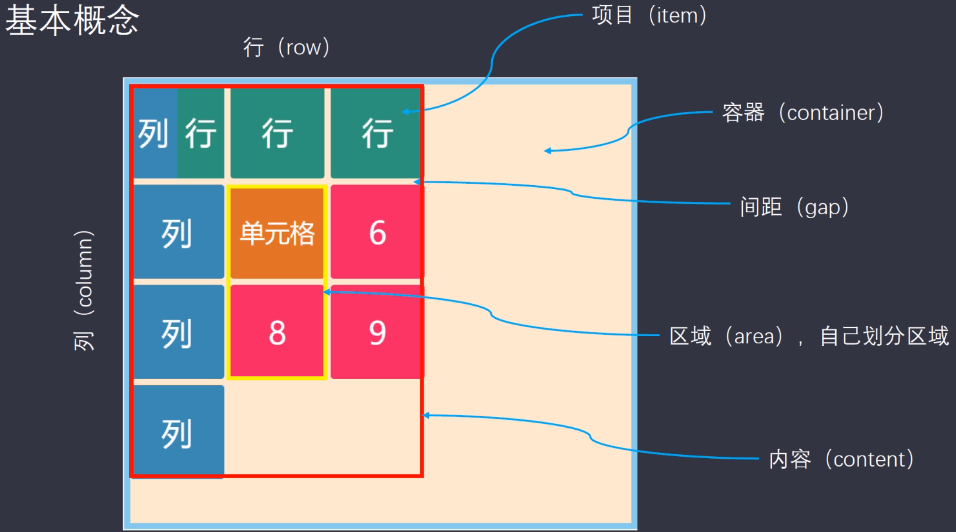
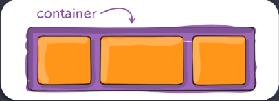
# 容器 - 有容器的属性
# 容器的属性
.container{
  display:grid

  grid-template-columns; /*定义多少列,多宽*/
  grid-template-rows; /*定义多少行,多宽*/
  row-gap; /*行的间距*/
  column-gap; /*列的间距*/
  gap; /*间距*/
  grid-template-areas:'a b c' 'd e f' 'g h i' 'j'; /*划分区域,给每块区域命名*/
  grid-auto-flow; /*排列方式,默认row ,第二个参数可加可不加dense,加了会自动补全位置*/
  justify-items:start | end | center | stretch; /*网格内的内容对齐方式 - 横向*/
  align-items:start | end | center | stretch; /*网格内的内容对齐方式 - 纵向*/
  place-items; /*justify-items 和 align-items 的简写:第一个参数为横向,第二个参数为纵向*/
  justify-content:start | end | center | stretch | space-around | space-between | space-evenly; /*相对于容器的定位 - 横向*/
  align-content:start | end | center | stretch | space-around | space-between | space-evenly; /*相对于容器的定位 - 纵向*/
  place-content:start | end | center | stretch | space-around | space-between | space-evenly; /* justify-content 和 align-content 的简写 */
  gird-auto-columns; /*用来设置多出来的item的宽*/
  gird-auto-rows; /*用来设置多出来的item的高*/
}
.item{

}
1
2
3
4
5
6
7
8
9
10
11
12
13
14
15
16
17
18
19
20
21
22
2
3
4
5
6
7
8
9
10
11
12
13
14
15
16
17
18
19
20
21
22
# 例子:
<style>
.item-1{
  background-color:#111
}
.item-2{background-color:#333}
.item-3{background-color:#666}
.item-4{background-color:#888}
.item-5{background-color:#8d0922}
.item-6{background-color:#194ddd}
.item-7{background-color:#f68f67}
.item-8{background-color:#00ff00}
.item-9{background-color:#ff00ff}
.item-10{background-color:#0000ff}
.main{
  display:grid;
  width:600px;
  height:600px
  border:10px solid red;
  <!-- grid-template-columns:100px 100px 100px; /*定义三列,每列宽100px*/ -->
  grid-template-columns:repeat(3,100px); /*和上面的一样;repeat:第一个参数有个auto-fill自动填充的功能;第二个参数有个fr 代指均分*/
  grid-template-rows:100px 100px 100px 100px;/*定义四行,每列宽100px*/
}
</style>
<body>
  <div class="main>
    <div class="item item-1">1</div>
    <div class="item item-2">2</div>
    <div class="item item-3">3</div>
    <div class="item item-4">4</div>
    <div class="item item-5">5</div>
    <div class="item item-6">6</div>
    <div class="item item-7">7</div>
    <div class="item item-8">8</div>
    <div class="item item-9">9</div>
    <div class="item item-10">10</div>
  </div>
</body>
1
2
3
4
5
6
7
8
9
10
11
12
13
14
15
16
17
18
19
20
21
22
23
24
25
26
27
28
29
30
31
32
33
34
35
36
37
2
3
4
5
6
7
8
9
10
11
12
13
14
15
16
17
18
19
20
21
22
23
24
25
26
27
28
29
30
31
32
33
34
35
36
37
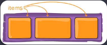
# 项目 - 有项目的属性
# 项目属性
.container{
  display:grid
}
.item{
  grid-column-start; /*列的开始*/
  grid-column-end; /*列的结束*/
  grid-row-start; /*行的开始*/
  grid-row-end; /*行的结束*/
  grid-column;/*1-2的简写*/
  grid-row;/*3-4的简写*/
  grid-area;/*当容器指定区域后,项目可以直接选中区域,指定在哪个区域 ; 或指定grid-column和gird-row*/
  justify-self:start | end | center | stretch;/*设置单元格内容的水平位置*/
  align-self:start | end | center | stretch;/*设置单元格内容的垂直位置*/
  place-self:start | end | center | stretch; /*8-9的简写*/
}
1
2
3
4
5
6
7
8
9
10
11
12
13
14
15
2
3
4
5
6
7
8
9
10
11
12
13
14
15